BRAND NAME: THE BURGER FACTORY
INDUSTRY: FOOD & BEVERAGE / QUICK SERVICE RESTAURANT (QSR)
SCOPE: LOGO DESIGN & BRAND IDENTITY GUIDELINES
DESIGNER: HEMANTH KUMAR
OVERVIEW
The Burger Factory is a premium burger cafe in Florida, built around bold flavor, quality ingredients and a memorable customer experience. Mesh & Myth developed a complete visual identity designed to give the brand a distinctive presence across packaging, signage, digital touchpoints and the in-store experience.
THE CHALLENGE
The challenge was to create a distinctive identity in a category crowded with familiar burger cliches and interchangeable visual styles. The brand needed to feel a premium without becoming too polished, remain approachable, and work consistently across packaging, signage, digital content and the physical cafe experience.
THE IDEA
The idea was to build a bold, confident identity that felt rooted in burger culture without relying on predictable visual cues. Every element was designed to feel direct, energetic and distinctive, giving The Burger Factory a recognizable personality that could carry across every customer touchpoint.
BRAND STRATEGY
The brand strategy focused on positioning The Burger Factory as a premium yet approachable food brand with a strong, recognizable personality. The system was built around quality, consistency, and a modern customer experience, creating a clear foundation for every visual and verbal expression.
AUDIENCE
Built for customers who value quality food, strong visual experiences and brands with personality - from casual diners and young professionals to families looking for a more considered burger experience.
POSITIONING
A modern premium burger cafe that combines quality, character and approachability without feeling overly formal or predictable.
LOGO SYSTEM
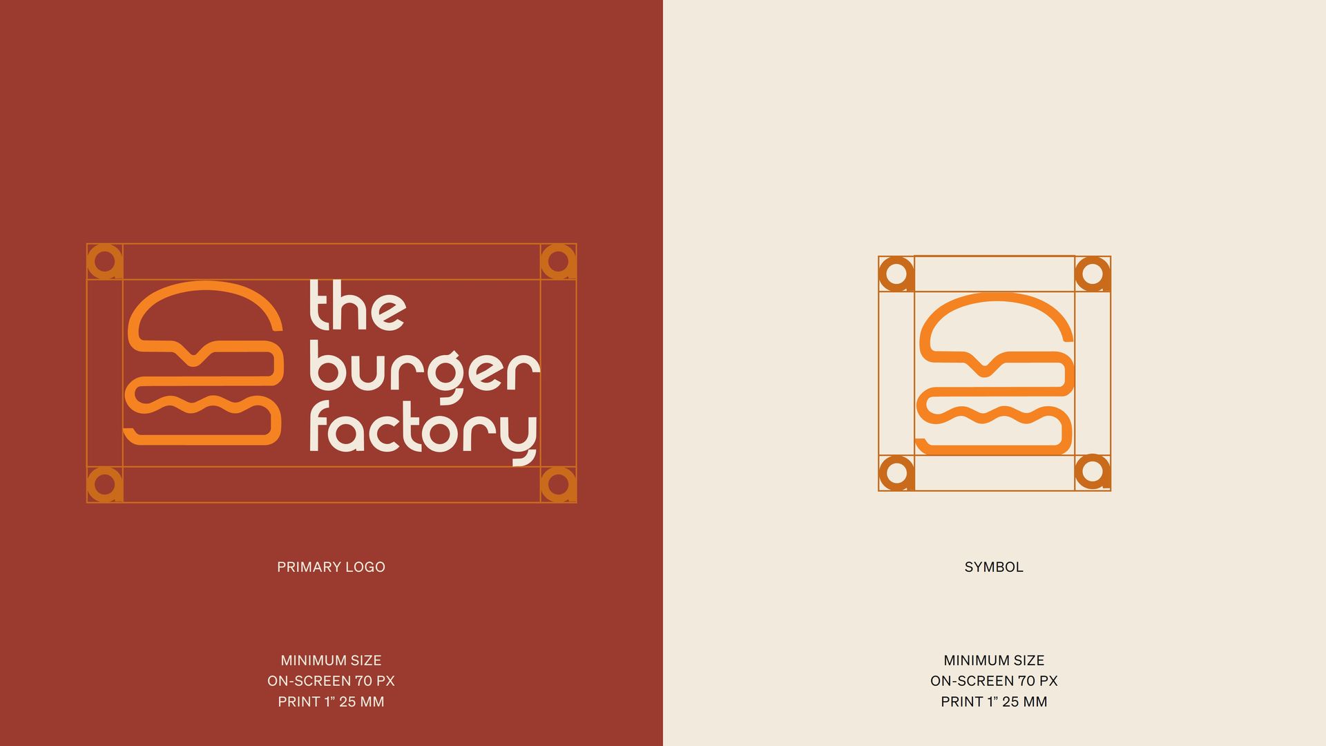
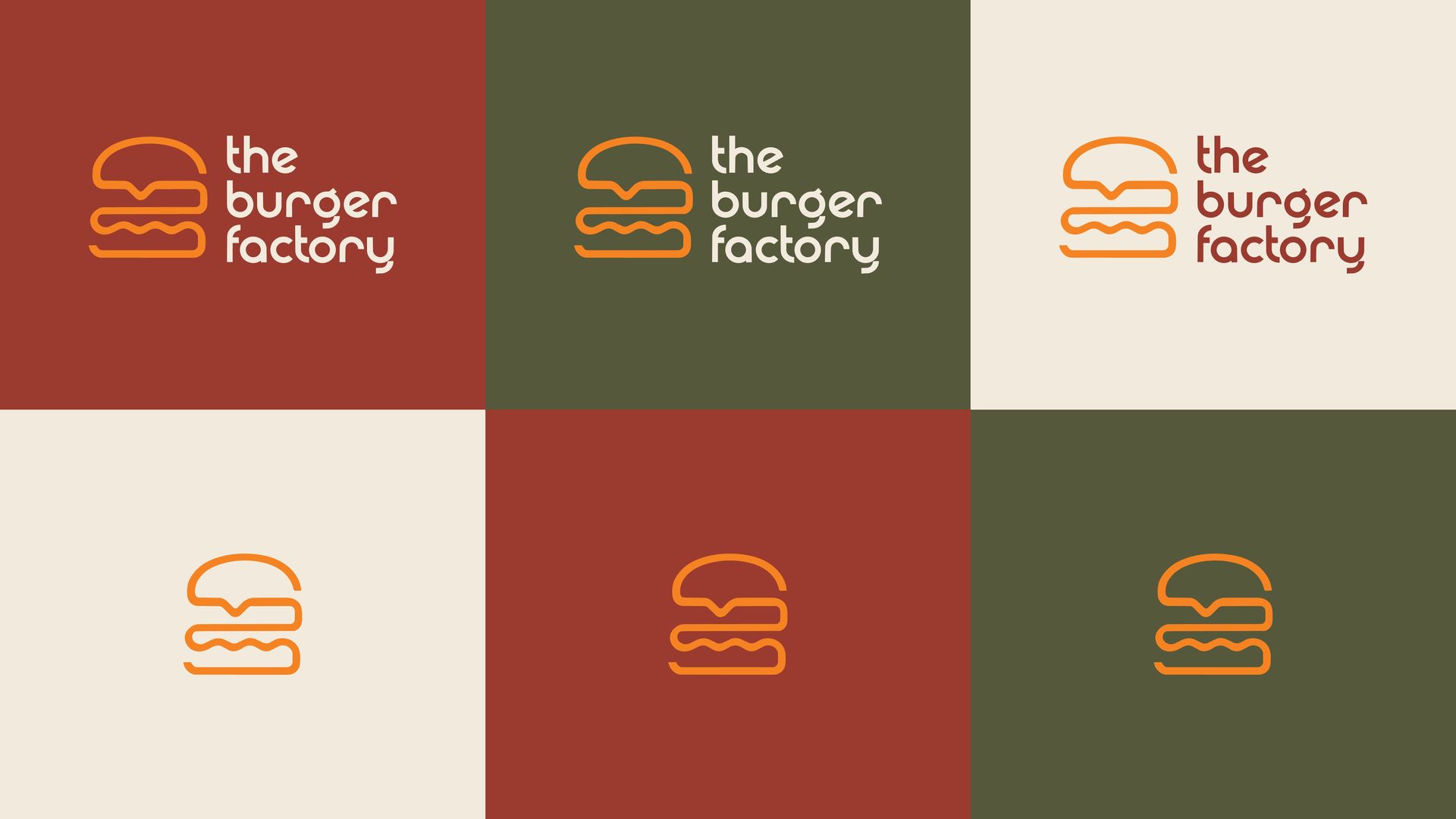
The Burger Factory identity is built around a customer burger symbol paired with a bold, approachable wordmark. The symbol simplifies the product into a distinctive graphic form, while the wider lockup gives the brand its full personality. Both versions follow a consistent geometric structure, allowing the identity to stay clear, balanced and recognizable across digital, print, and physical applications.
COLOR APPLICATION
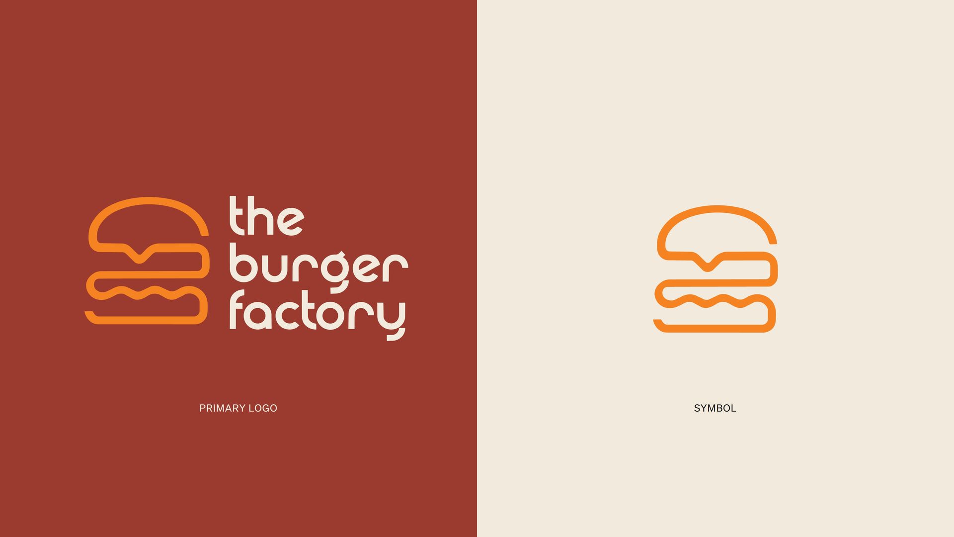
The color system was designed to keep the identity bold, warm and instantly recognizable. Deep red and olive create depth and character, while the orange accent adds energy and appetite appeal. The palette works flexibly across both the full logo and standalone symbol.
COLOR PALETTE
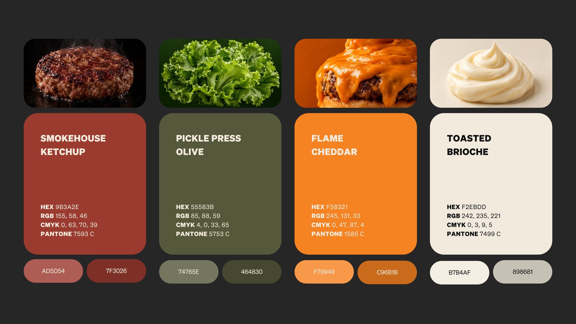
The palette draws directly from the ingredients and atmosphere of the brand. Smokehouse Ketchup, Pickle Press Olive, Flame Cheddar and Toasted Brioche create a warm, appetite-led system that feels familiar to the category while giving The Burger Factory a distinctive and ownable visual character.
SUPPORTING NEUTRALS
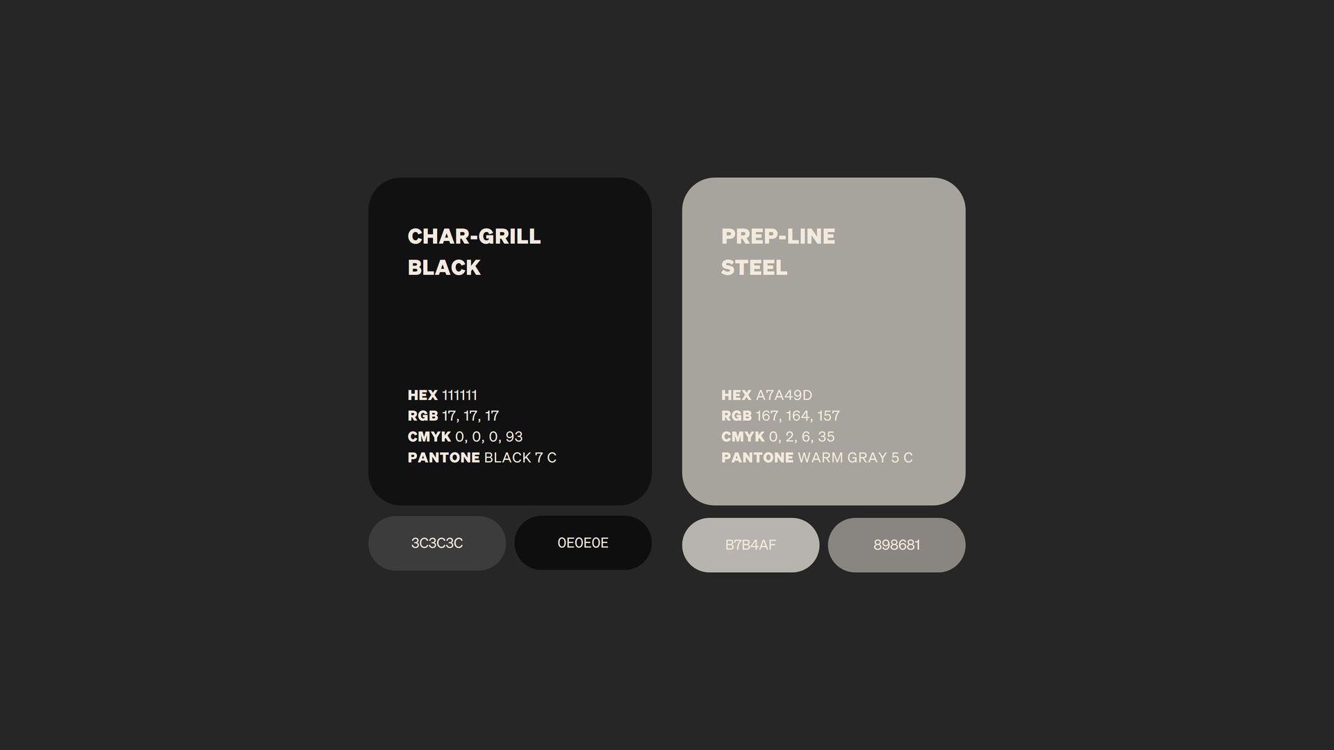
Char-Grill Black and Prep-Line Steel form the neutral foundation of the palette. Inspired by the kitchen environment, they add structure, contrast and balance to the warmer food-led colors, helping the identity stay grounded and versatile across signage, packaging, digital and interior applications.
TYPOGRAPHY
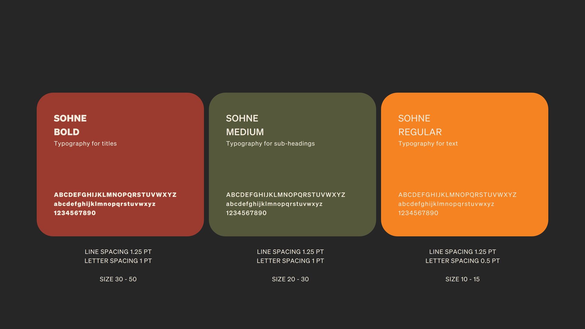
Sohne gives the brand a clean, contemporary voice while keeping the system flexible and easy to use. Bold carries the strongest headlines, Medium supports secondary messaging, and Regular handles everyday communication - creating a clear hierarchy that stays consistent across packaging, menus, signage and digital applications.
BRAND PATTERN
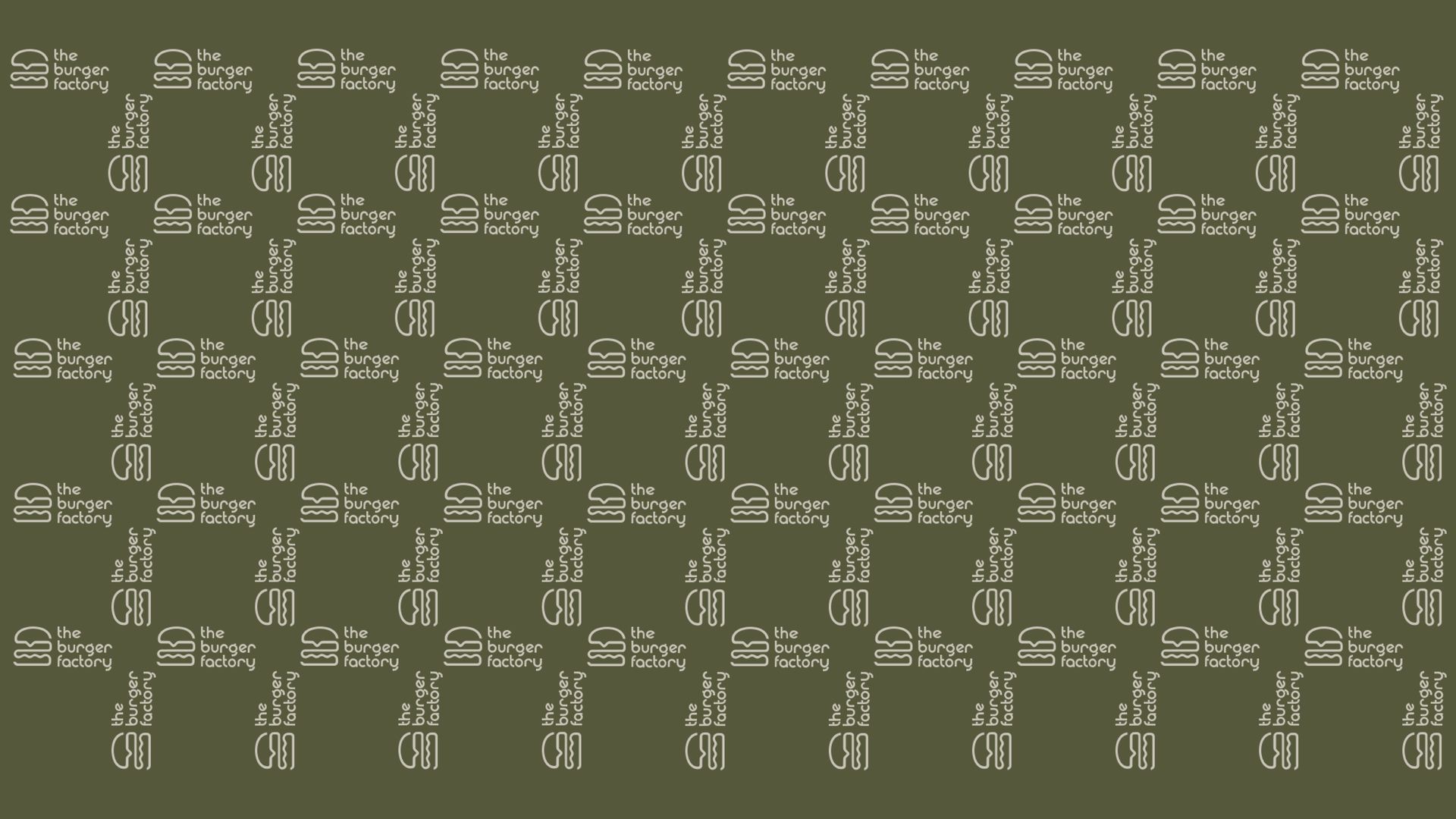
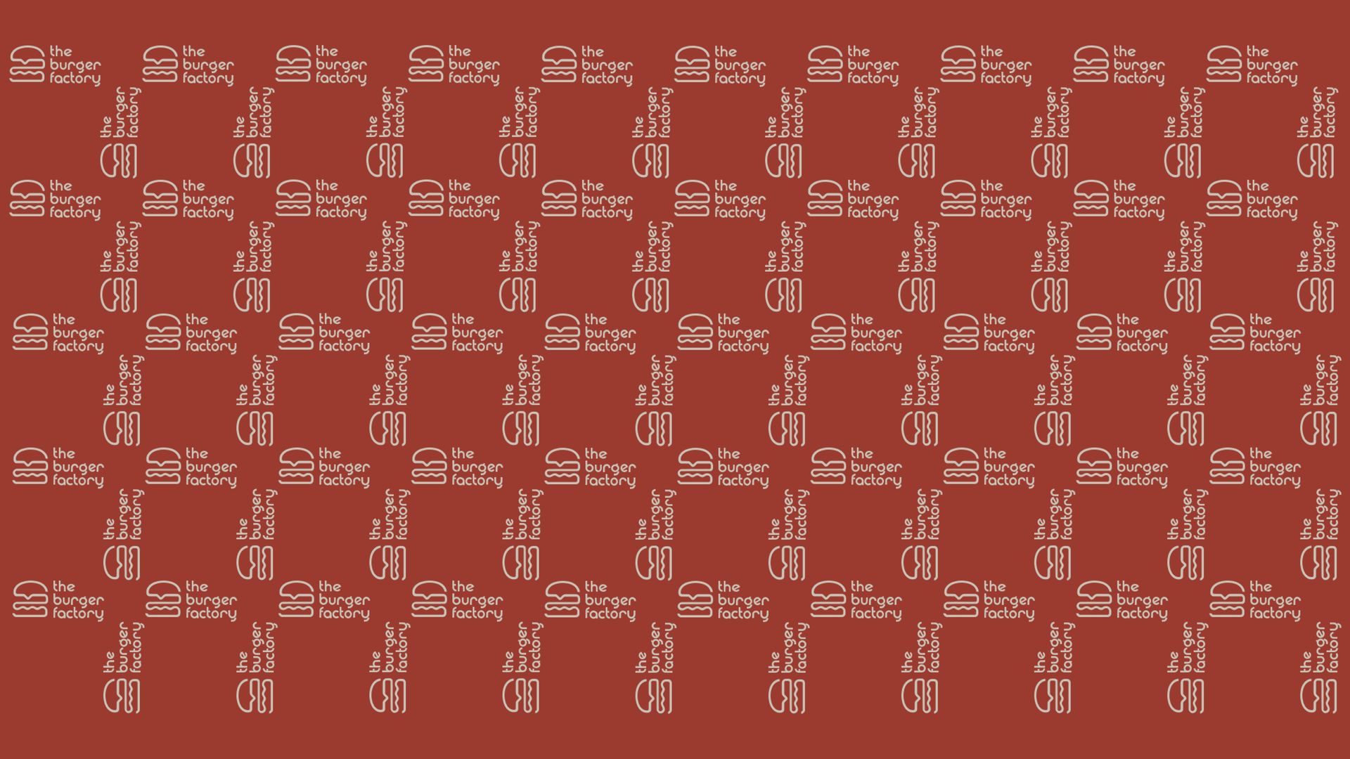
The pattern extends the identity into a repeatable graphic asset, combining the logo and symbol in alternating orientations to create rhythm, movement and instant brand recognition. It can scale from subtle background texture to a more expressive visual device without competing with the core identity.
It can be applied across burger wrappers, takeaway bags, boxes, cups, tray liners, uniforms, menus, social-media, website backgrounds, delivery packaging, merchandise, wall graphics, signage and other in-store touchpoints.
BRAND IN ACTION
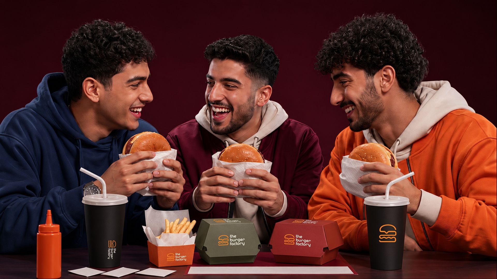
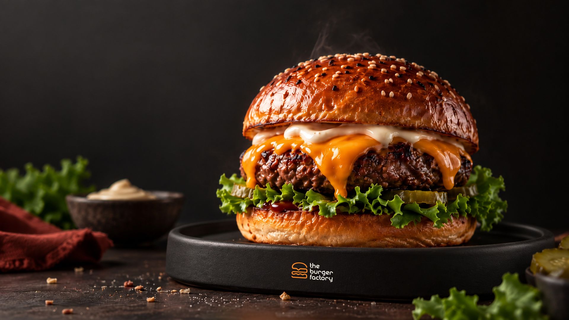
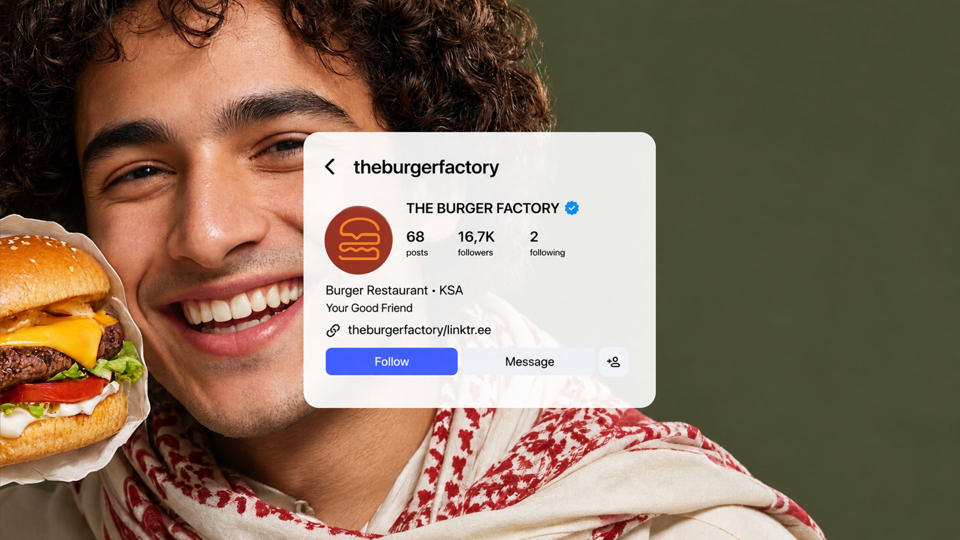
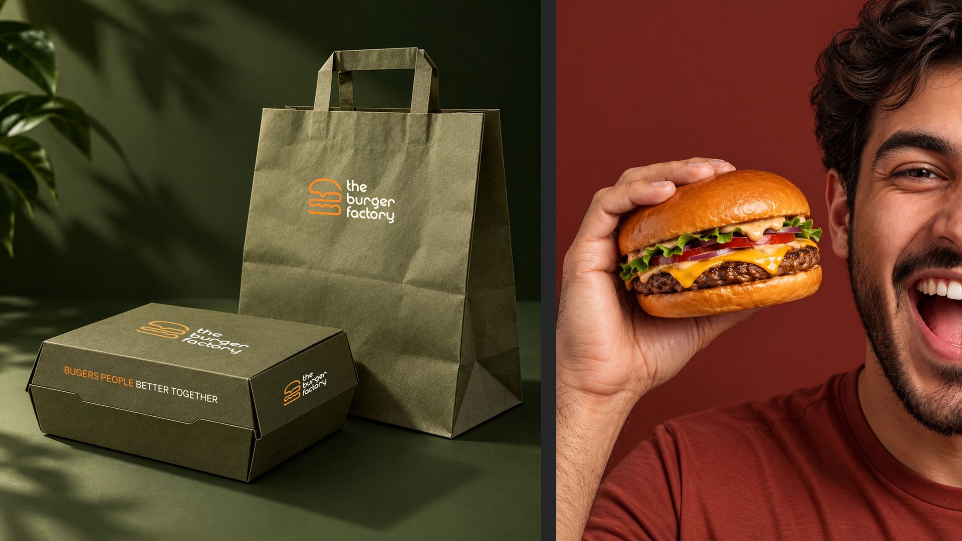
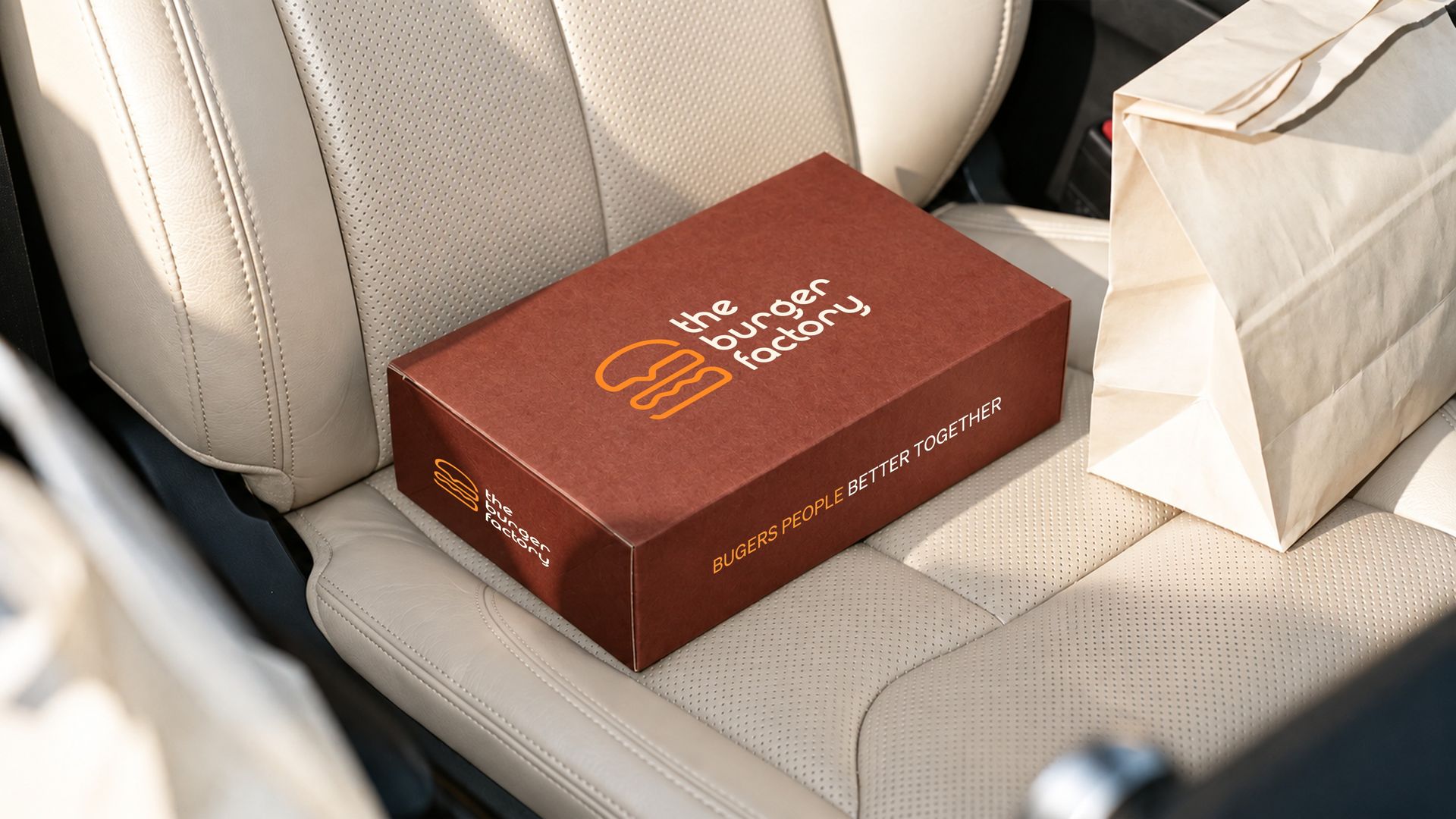
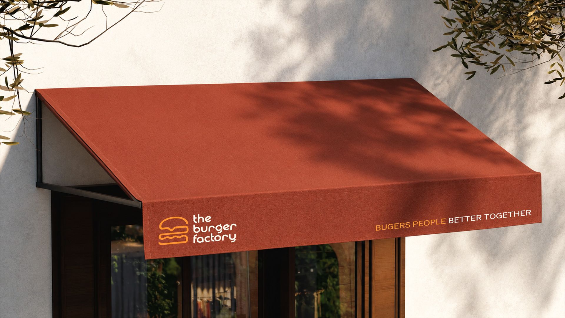
The identity comes to life across every customer touchpoint - from packaging and takeaway bags to storefront signage, food photography and campaign imagery. Each application uses the same color, typography and graphic system to create a consistent experience, whether the brand is seen on the street, on the table, online or on the move.
THE OUTCOME
Designed by Mesh & Myth, a brand identity and creative studio based in Bengaluru (Bangalore), India, and led by Hemanth Kumar, Brand Designer, Founder & Creative Director, The Burger Factory identity was created for a premium Food & Beverage / QSR brand in Florida, USA. The final system brings together brand strategy, logo design, visual identity, typography, color, packaging, signage, and digital applications into one cohesive experience - giving The Burger Factory a distinctive, scalable and recognizable presence across every customer touchpoint.
WHAT THEY SAID

"Hemanth somehow took everything in our heads, cleaned up the chaos and turned it into a brand that actually feels like us. The whole identity works everywhere, from the storefront to the burger wrappers, without losing its personality. We asked for a burger brand. Mesh & Myth gave us one we'd happily wear on a t-shirt. And yes, the burgers still deserve some credit."
- ETHAN BROOKS, Burger Guy in Charge