
EARTHSTONE CAPITAL
BRAND NAME: EARTHSTONE CAPITAL
INDUSTRY: PRIVATE INVESTMENT (REAL ESTATE & CONSTRUCTION)
SCOPE: LOGO DESIGN & BRAND IDENTITY GUIDELINES
DESIGNER: HEMANTH KUMAR
OVERVIEW
THE CHALLENGE
THE IDEA
The idea was to build a disciplined, authoritative identity rooted in Swiss Style design principles without relying on predictable corporate visual cues. Every element was designed to feel structural, precise, and distinctive, giving Earthstone Capital a recognizable personality that could carry across every digital and physical touchpoint.
BRAND STRATEGY
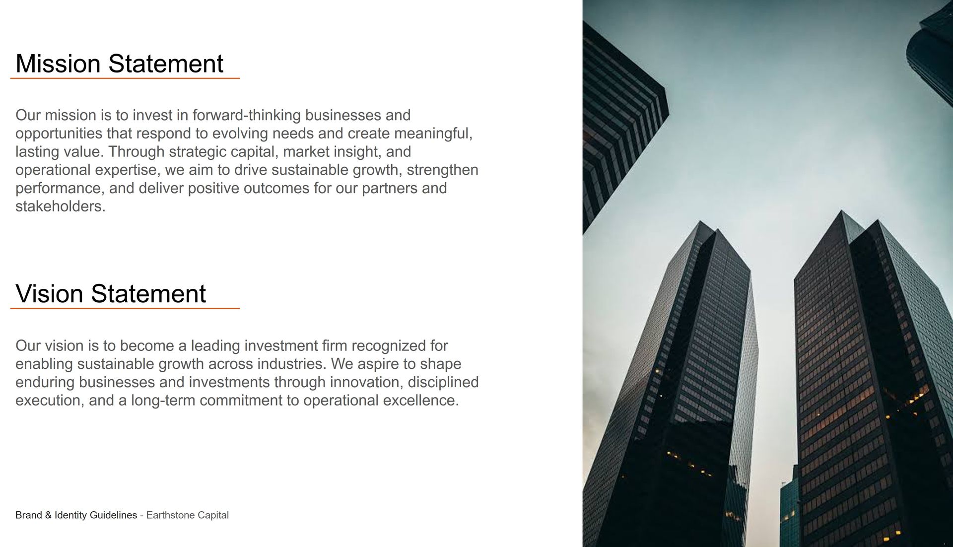
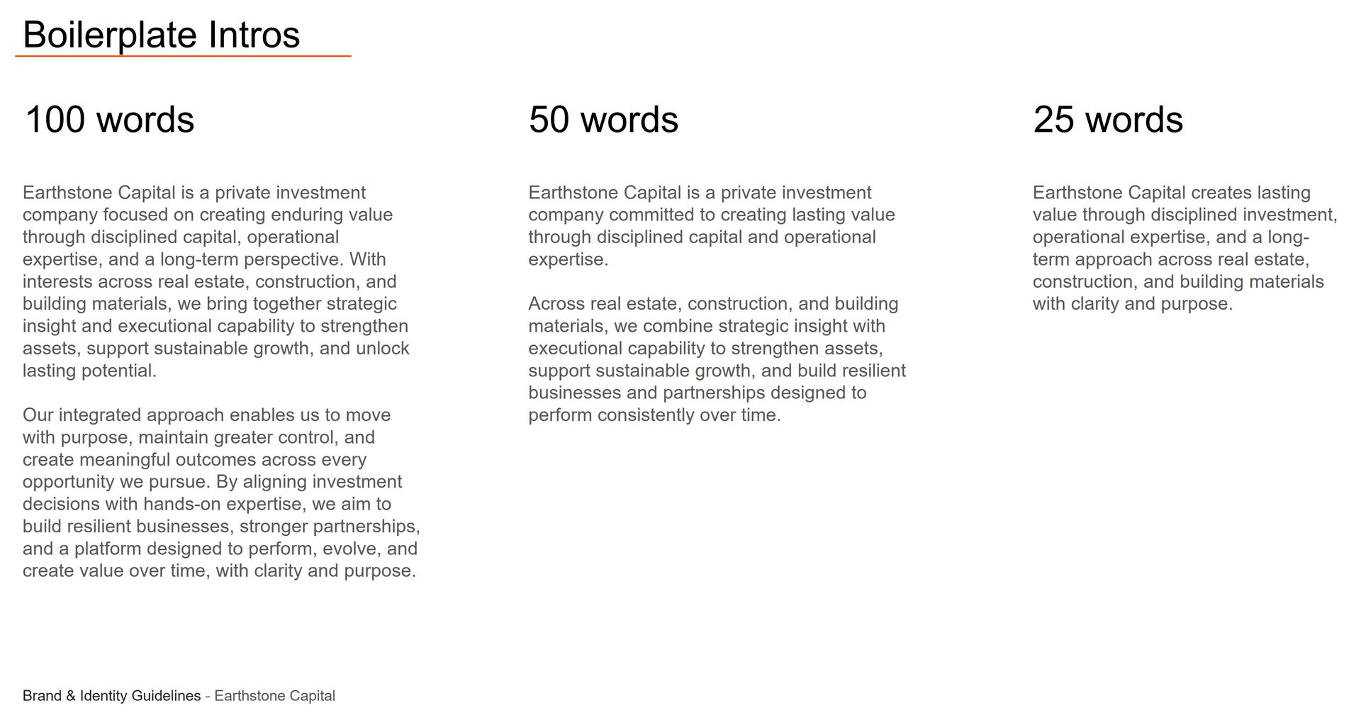
The brand strategy focused on positioning Earthstone Capital as an authoritative yet accessible investment firm with a strong, recognizable market presence. The system was built around financial discipline, operational excellence, and a long-term perspective, creating a clear foundation for every visual and strategic expression.
AUDIENCE
Built for stakeholders, partners, and industry leaders who value financial discipline, operational expertise, and brands with long-term vision—from institutional investors and real estate developers to construction executives seeking a more strategic investment partner.
POSITIONING
A modern private investment company that combines financial discipline, operational expertise and a long-term perspective without feeling overly traditional or bureaucratic.
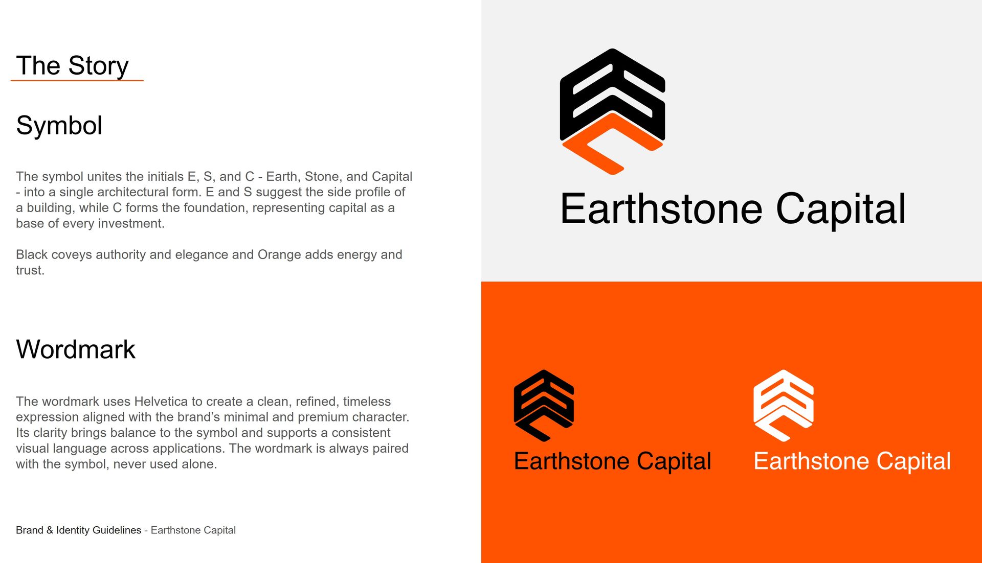
LOGO SYSTEM
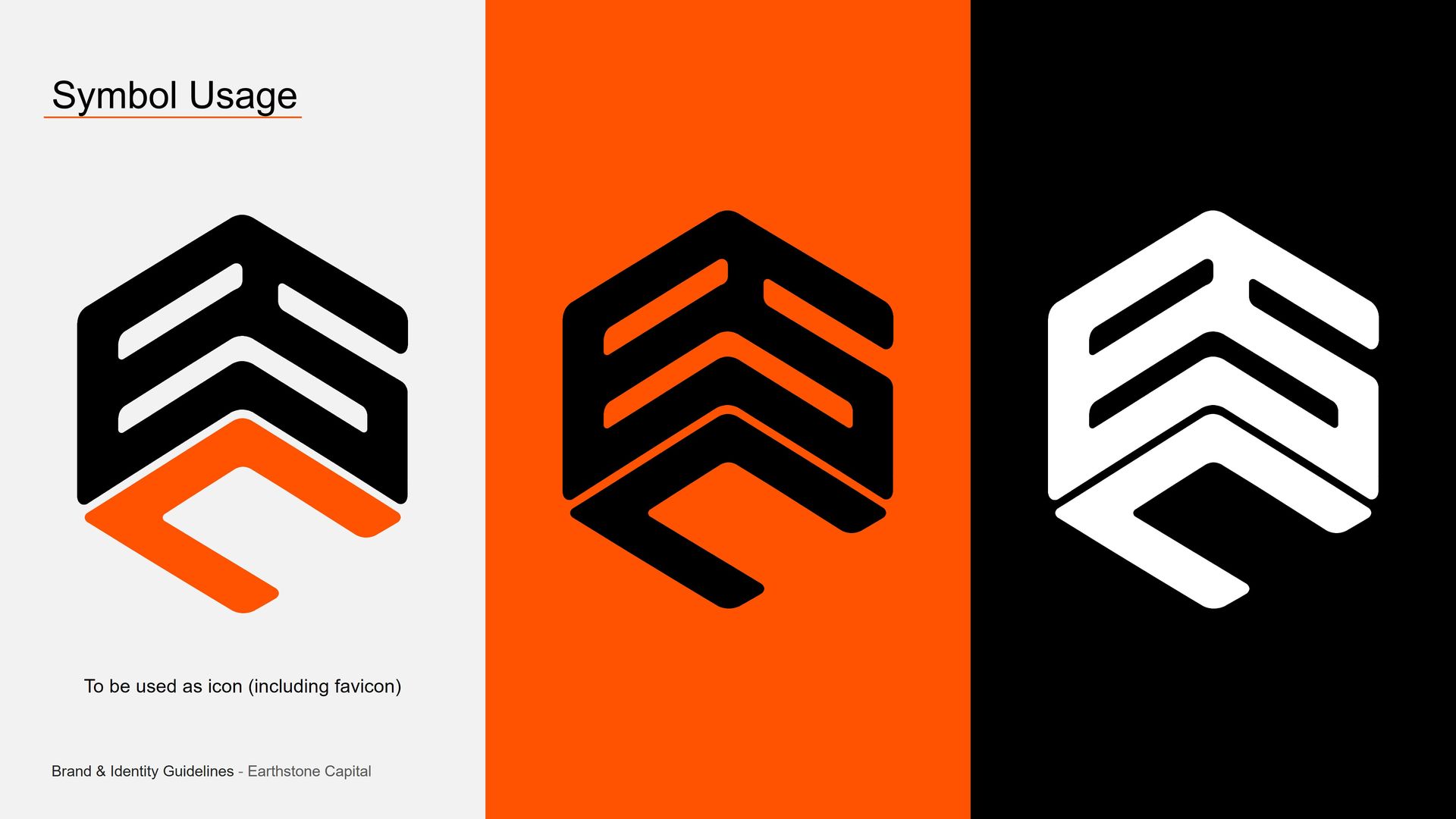
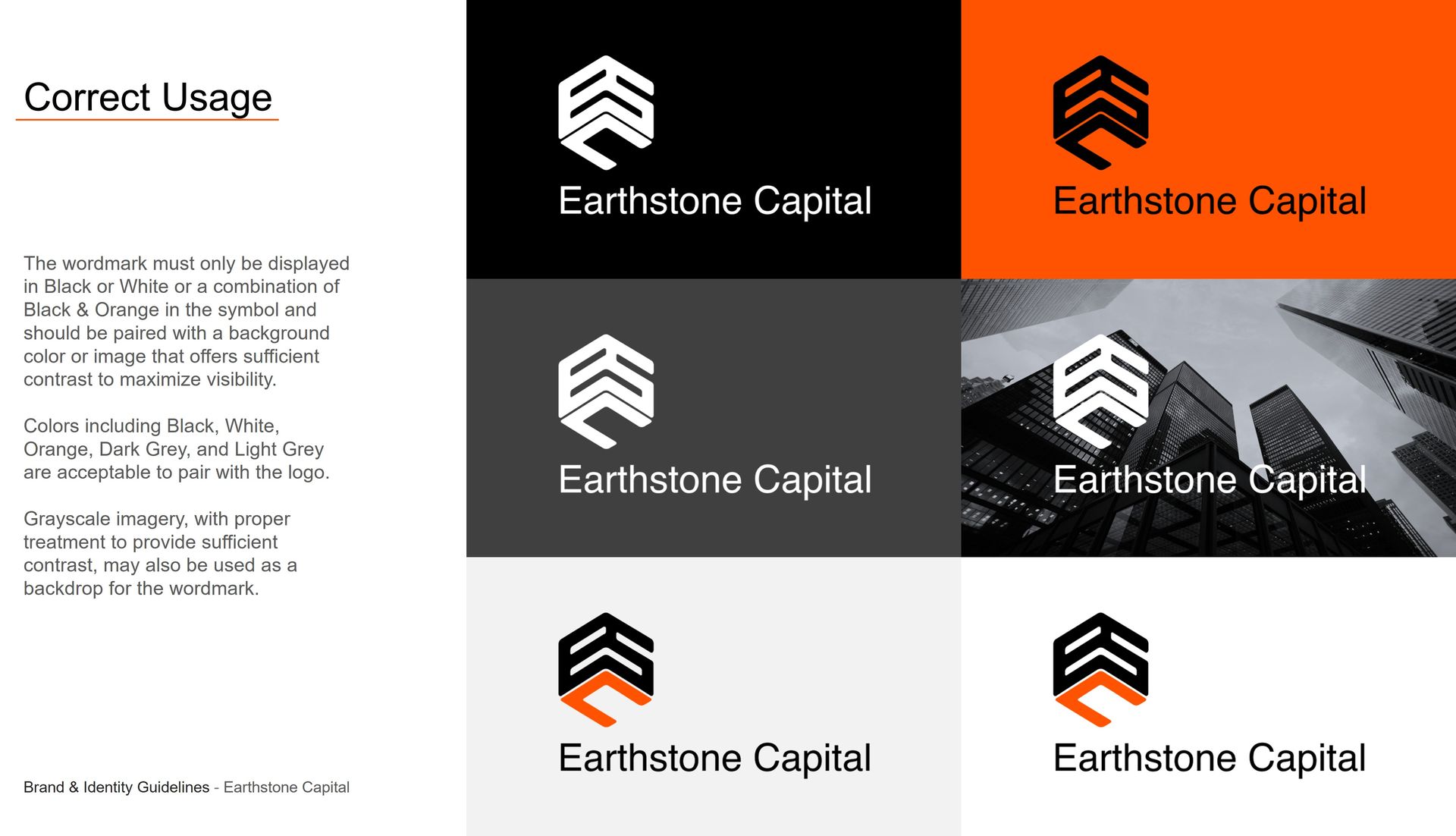
COLOR APPLICATION & LOGO USAGE
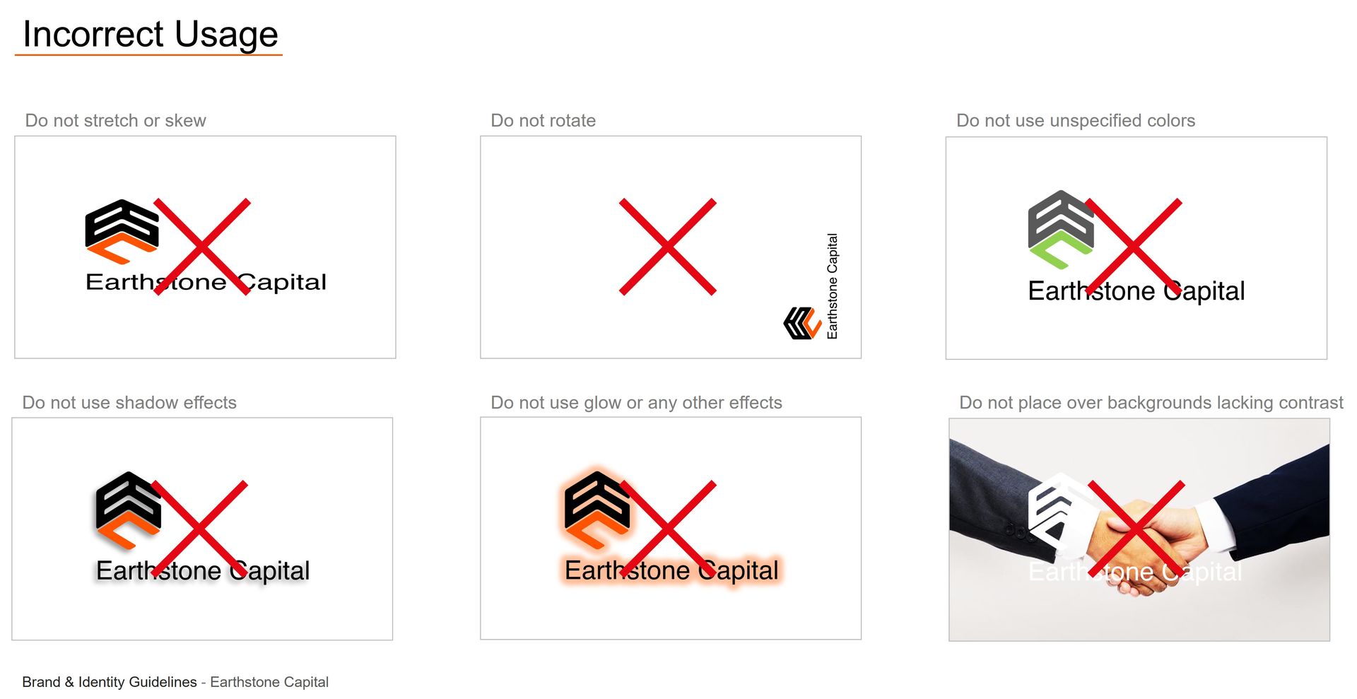
INCORRECT LOGO USAGE
COLOR PALETTE
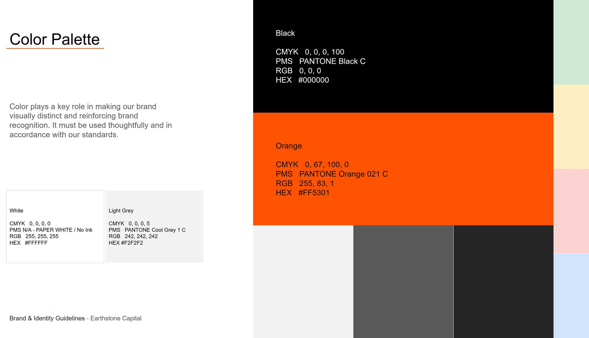
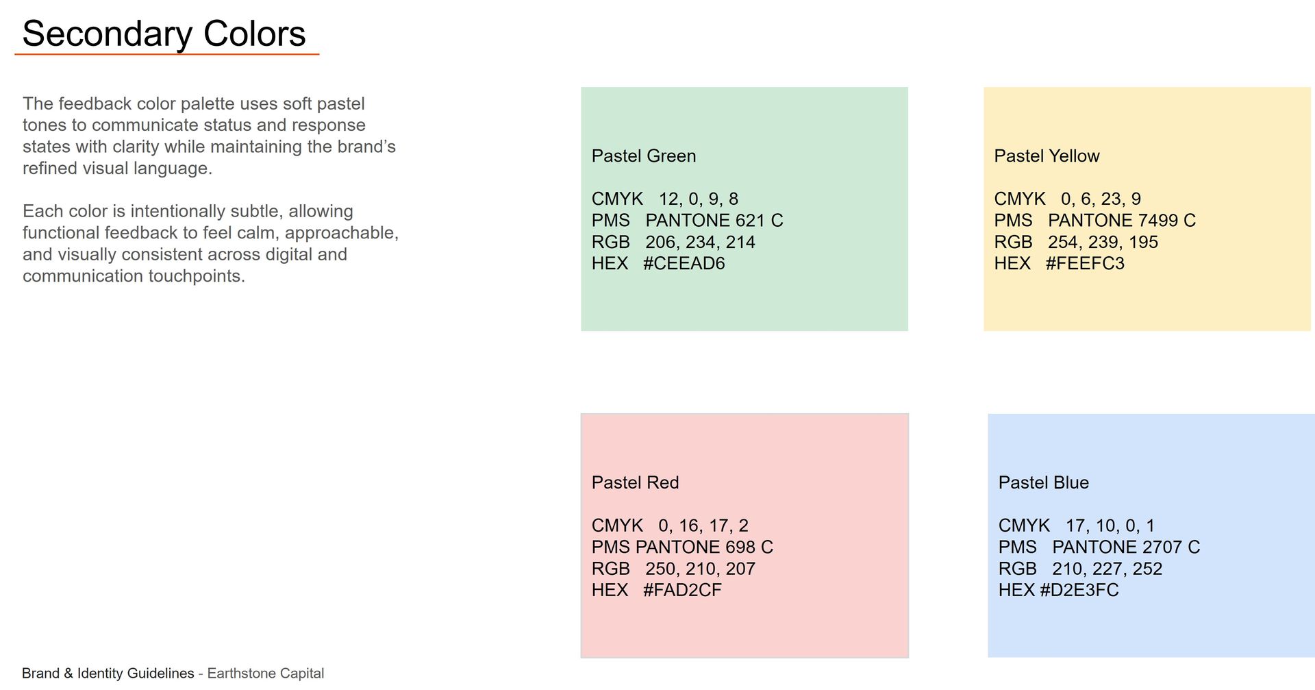
The primary color palette features Black (#000000), Orange (#FF5301), White (#FFFFFF), and Light Grey (#F2F2F2), anchoring brand distinctiveness. These colors are utilized prominently across all brand materials, calibrated precisely with specific CMYK, Pantone, RGB, and HEX values for seamless digital and print execution.
SUPPORTING NEUTRALS
TYPOGRAPHY
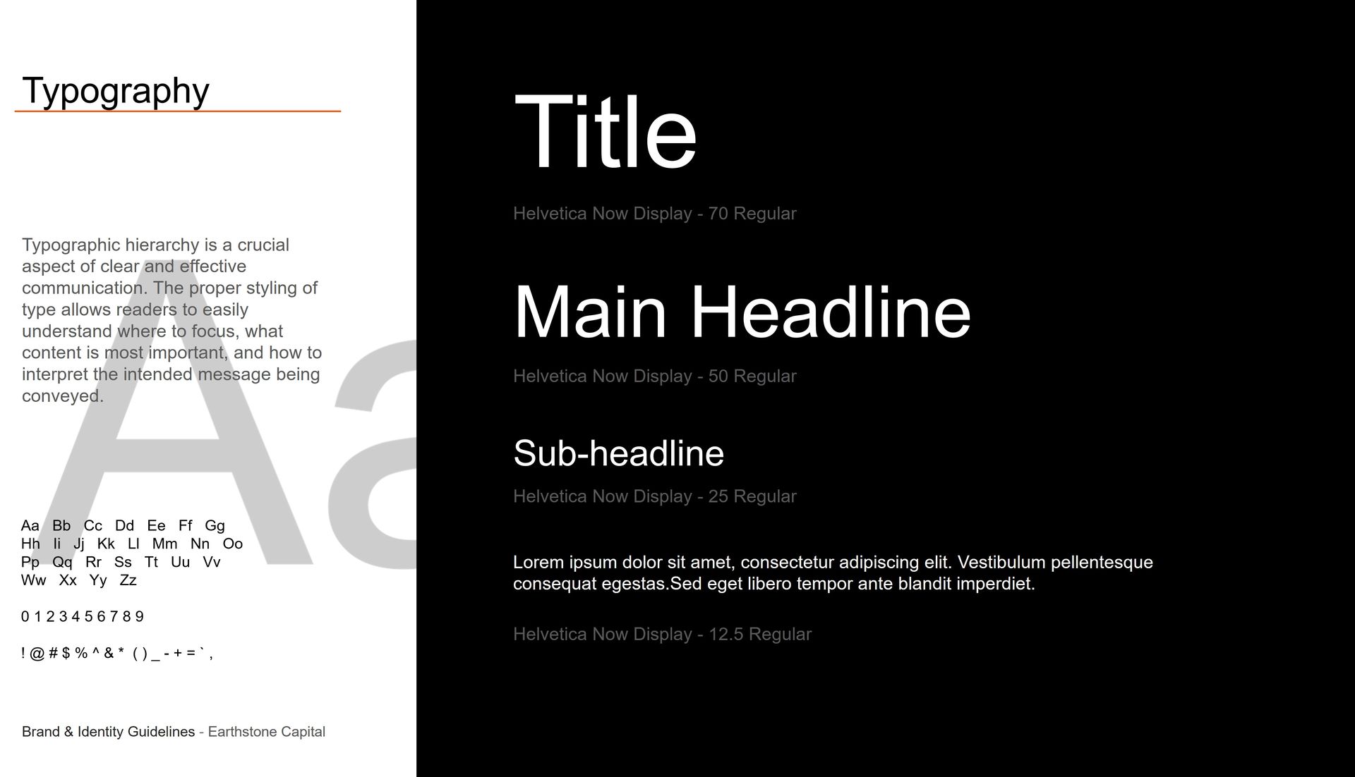
The typographic system relies on Helvetica Now Display to establish a clear, structured hierarchy. Scaling from 70 Regular titles down to 12.5 Regular body copy, the precise styling guides reader focus, ensuring effective communication and consistent brand expression.
ICONS STYLE
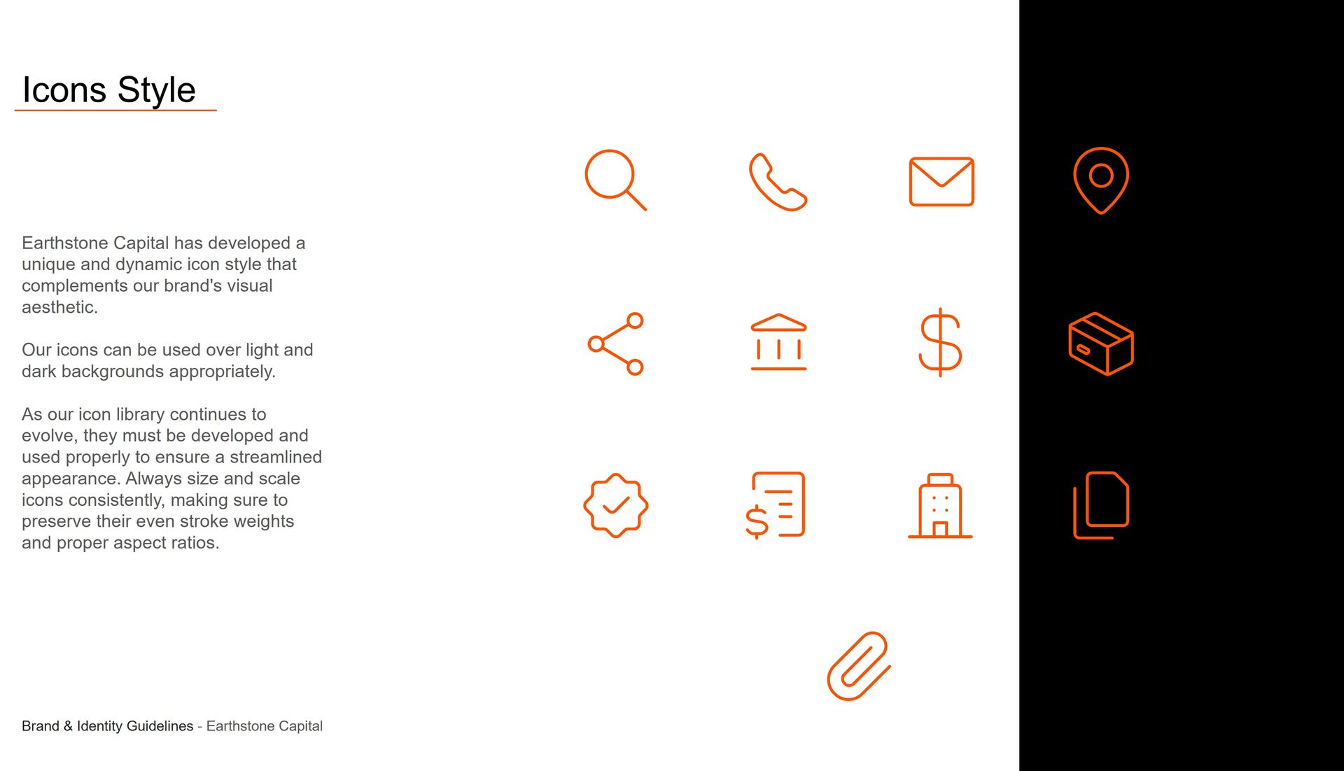
The dynamic icon style complements the brand's aesthetic and adapts seamlessly across light and dark backgrounds. To maintain a streamlined appearance as the library evolves, icons must be scaled consistently while preserving even stroke weights and proper aspect ratios.
THE OUTCOME
Designed by Mesh & Myth, a brand identity and creative studio based in Bengaluru (Bangalore), India, and led by Hemanth Kumar, Brand Designer, Founder & Creative Director, the Earthstone Capital identity was created for a private investment firm specializing in real estate, construction, and building materials. The final system brings together brand strategy, Swiss Style design principles, architectural logo architecture, typographic precision, color palettes, and digital touchpoints into one cohesive experience—giving Earthstone Capital a distinctive, scalable, and authoritative presence across every stakeholder touchpoint.
WHAT THEY SAID
"Hemanth and the team at Mesh & Myth completely transformed how Earthstone Capital presents itself in the market. They translated our complex multi-sector investment model into a sharp, sophisticated brand identity. The architectural logo, disciplined color system, and meticulous typographic hierarchy have given our firm an authoritative, premium presence that resonates deeply with our institutional partners. An exceptional strategic partner for any brand looking to scale with purpose."
- MARCUS VANCE, Director