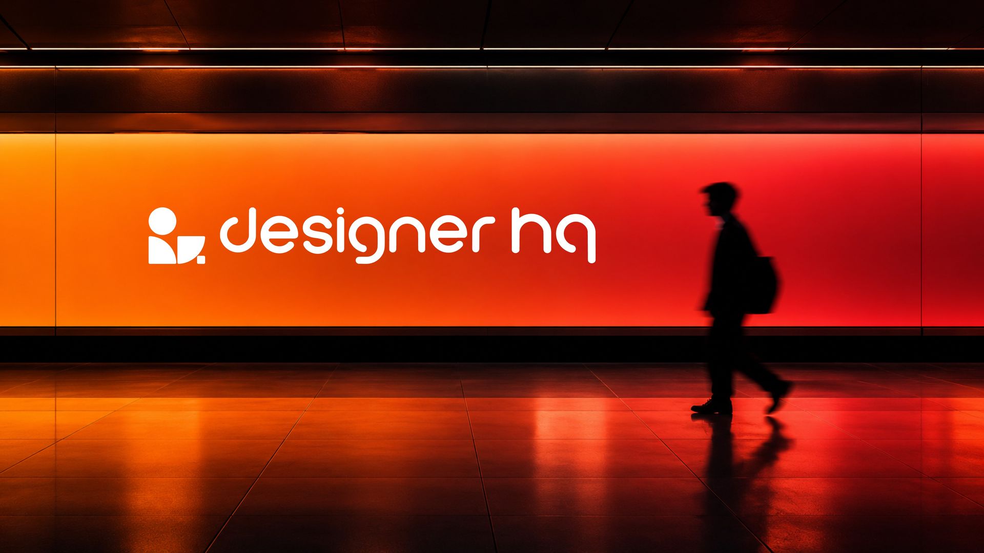
DESIGNER HQ
BRAND NAME: DESIGNER HQ
INDUSTRY: SAAS TOOL FOR DESIGNERS & CREATIVE STUDIOS
SCOPE: LOGO DESIGN
DESIGNER: HEMANTH KUMAR
OVERVIEW
Designer HQ is a creative workflow platform built to bring discovery, strategy, collaboration and brand delivery into one connected hub. Mesh & Myth developed a self-initiated visual identity concept exploring a bold geometric system that places the designer at the center while reflecting the platform’s four-stage workflow.
THE CHALLENGE
THE IDEA
The idea was to build a bold geometric identity that placed the designer at the centre of the platform. Four distinct forms were shaped to reflect Designer HQ’s workflow while subtly constructing “HQ,” creating a recognizable visual system that connects the product, process and brand in one unified mark.
EXPLORING THE CONSTRUCTION
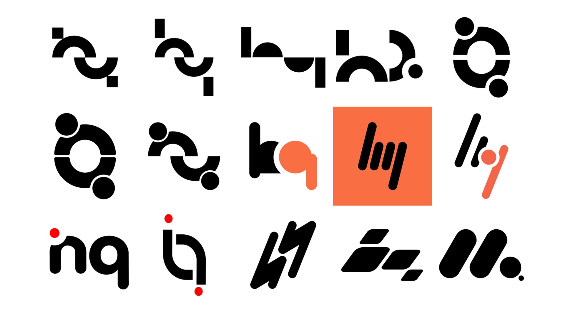
The construction began through extensive vector exploration, testing how simple geometric forms could interact, balance and build rhythm. I developed multiple variations, refining proposition, spacing and alignment to find a structure that felt intentional, distinctive and flexible enough to evolve into a strong visual identity.
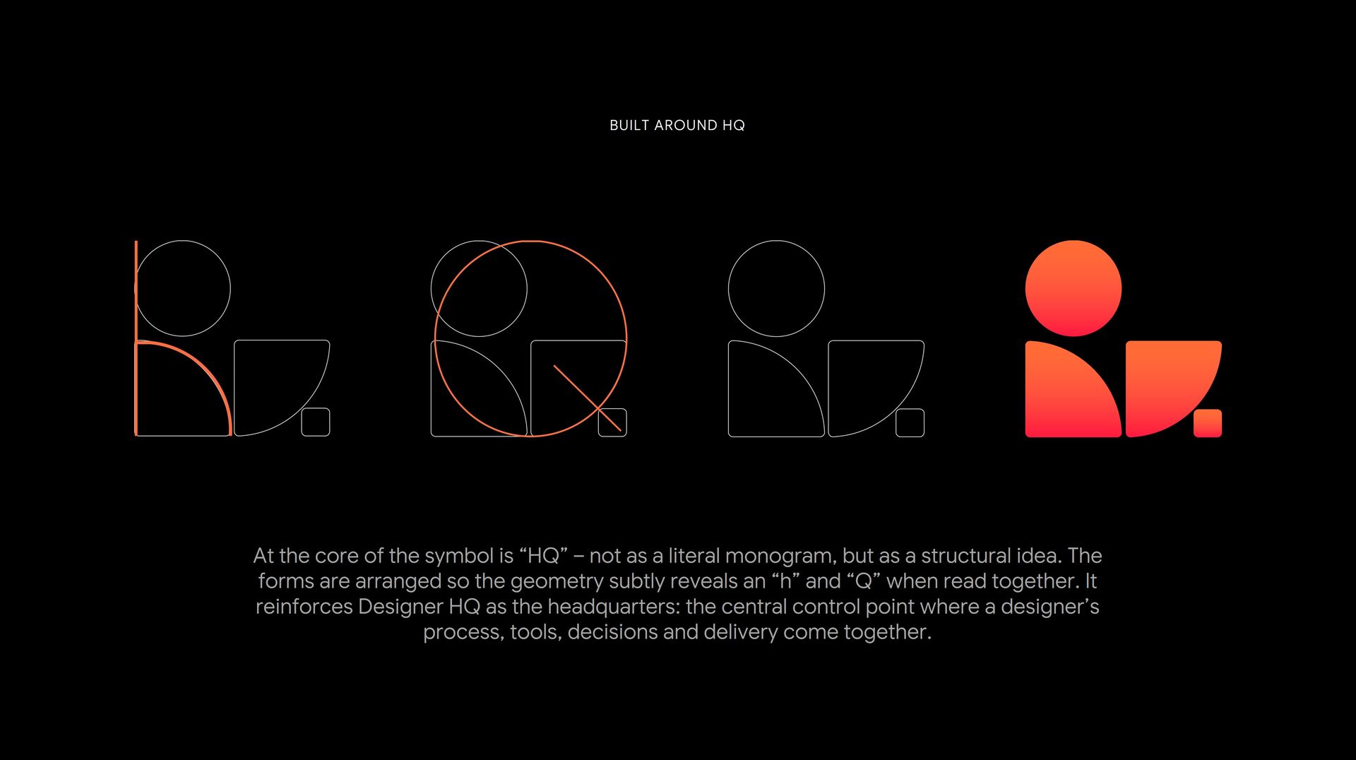
BUILT AROUND HQ
The symbol is constructed around “HQ” as a structural idea rather than a literal monogram. Carefully arranged geometric forms subtly reveal the letters while reinforcing Designer HQ as the central point where a designer’s process, tools, decisions and delivery come together.
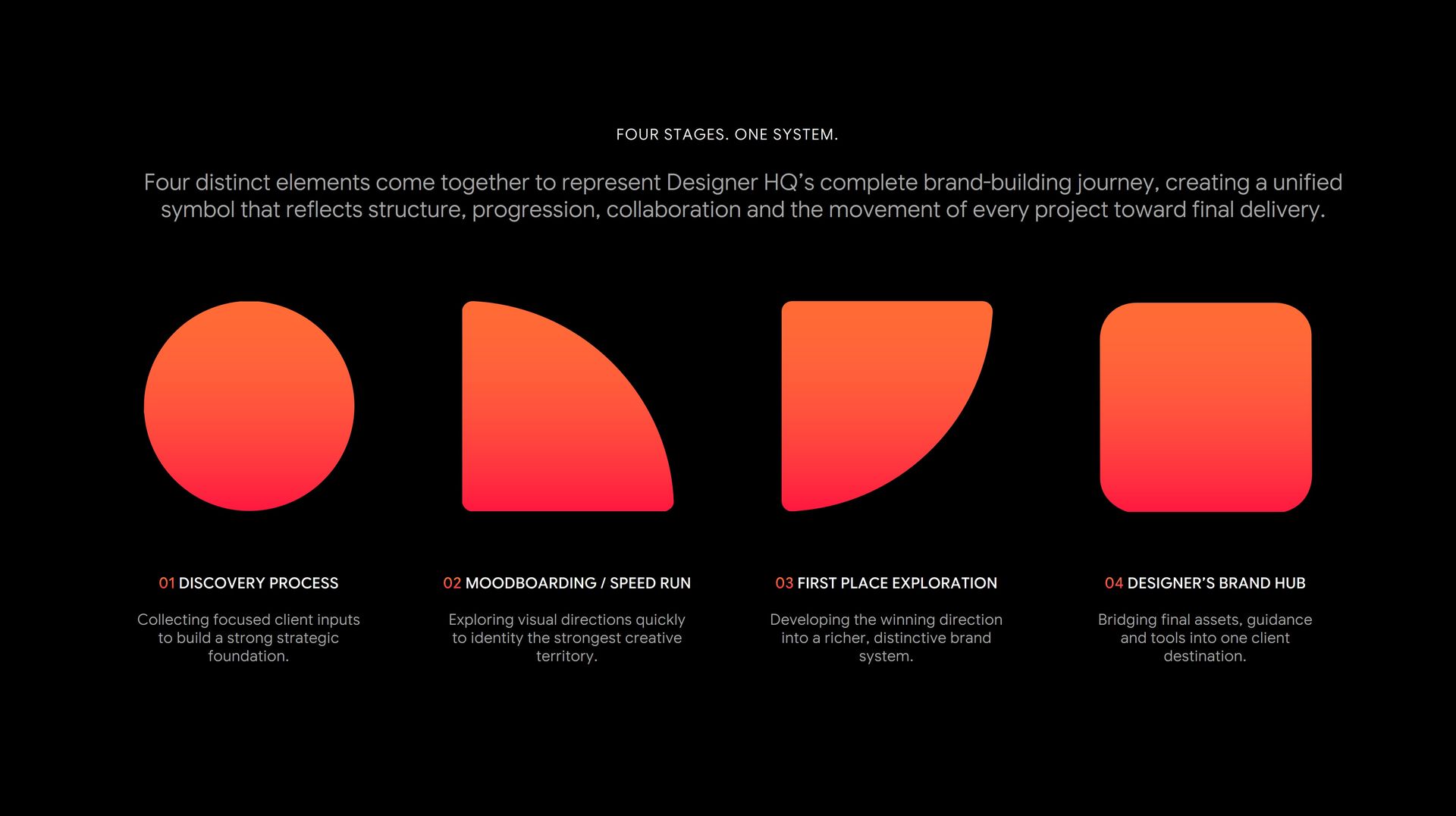
FOUR STAGES. ONE SYSTEM.
The symbol is built from four distinct forms, each representing a key stage in the Designer HQ workflow—from discovery and visual exploration to brand development and final delivery. Together, they create a unified system that turns the product’s process into a clear and meaningful visual language.
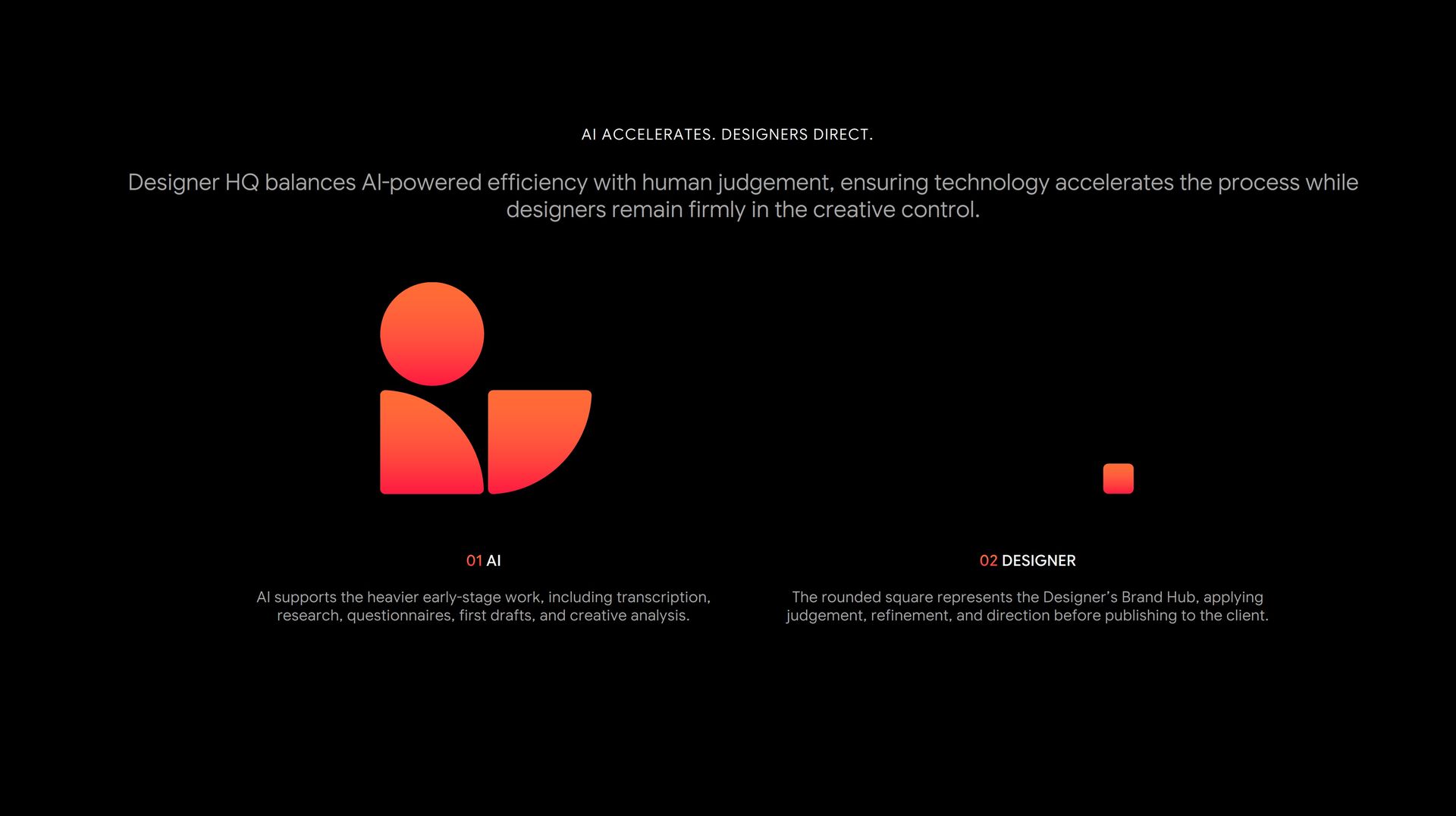
AI ACCELERATES. DESIGNERS DIRECT.
The identity reflects Designer HQ’s balance between AI-powered efficiency and human creative judgement. The larger forms represent technology supporting research, analysis and early-stage work, while the final element represents the designer—refining, directing and shaping the outcome before delivery.
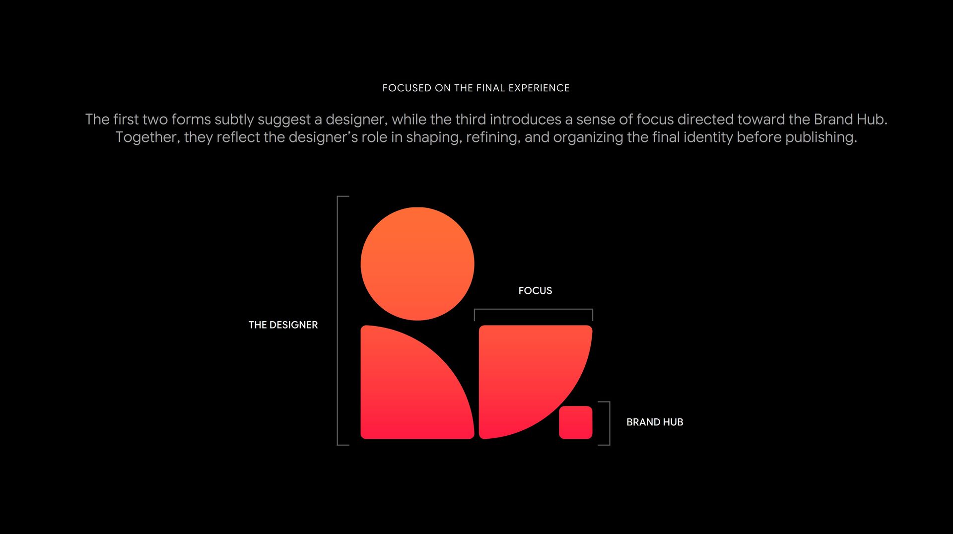
FOCUSED ON THE FINAL EXPERIENCE
The first two forms subtly suggest the designer, while the third creates a sense of focus directed toward the Brand Hub. Together, they express the designer’s role in shaping, refining and organizing the final identity before it reaches the client.
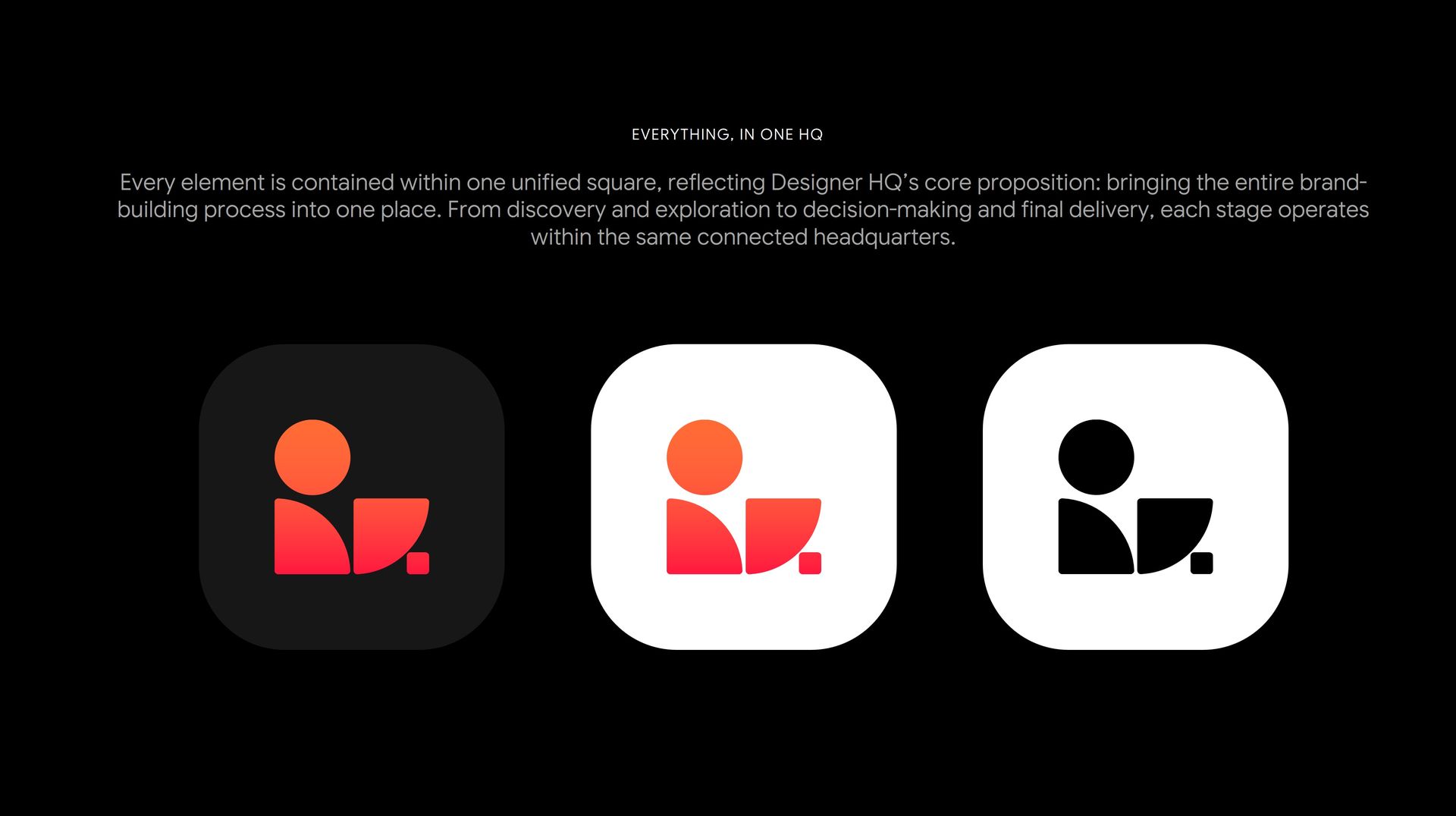
EVERYTHING, IN ONE HQ
The complete symbol is contained within a unified square, reinforcing Designer HQ as one connected space for the entire brand-building process. From discovery and exploration to decision-making and delivery, every stage comes together within a single, cohesive headquarters.
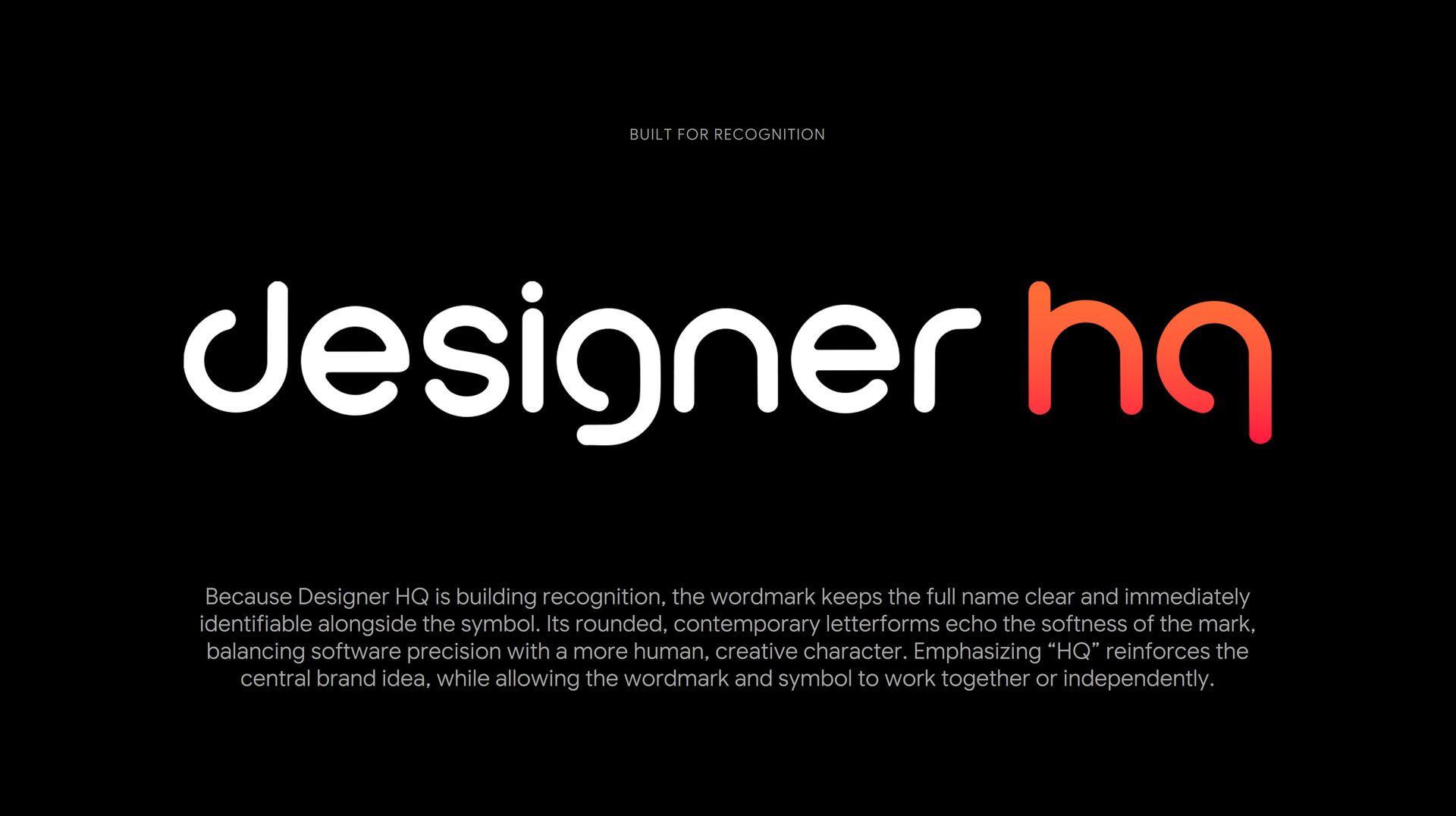
BUILT FOR RECOGNITION
The wordmark keeps the full Designer HQ name clear and immediately recognizable, while rounded letterforms introduce a softer, more human character. Highlighting “HQ” strengthens the central brand idea and creates a flexible identity that can work alongside the symbol or independently.
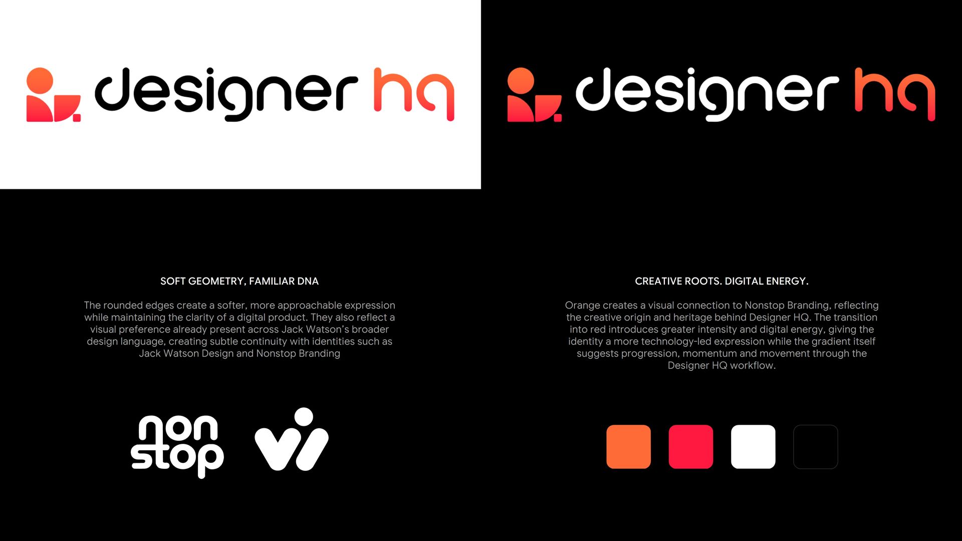
SOFT GEOMETRY. DIGITAL ENERGY.
IDENTITY IN ACTION
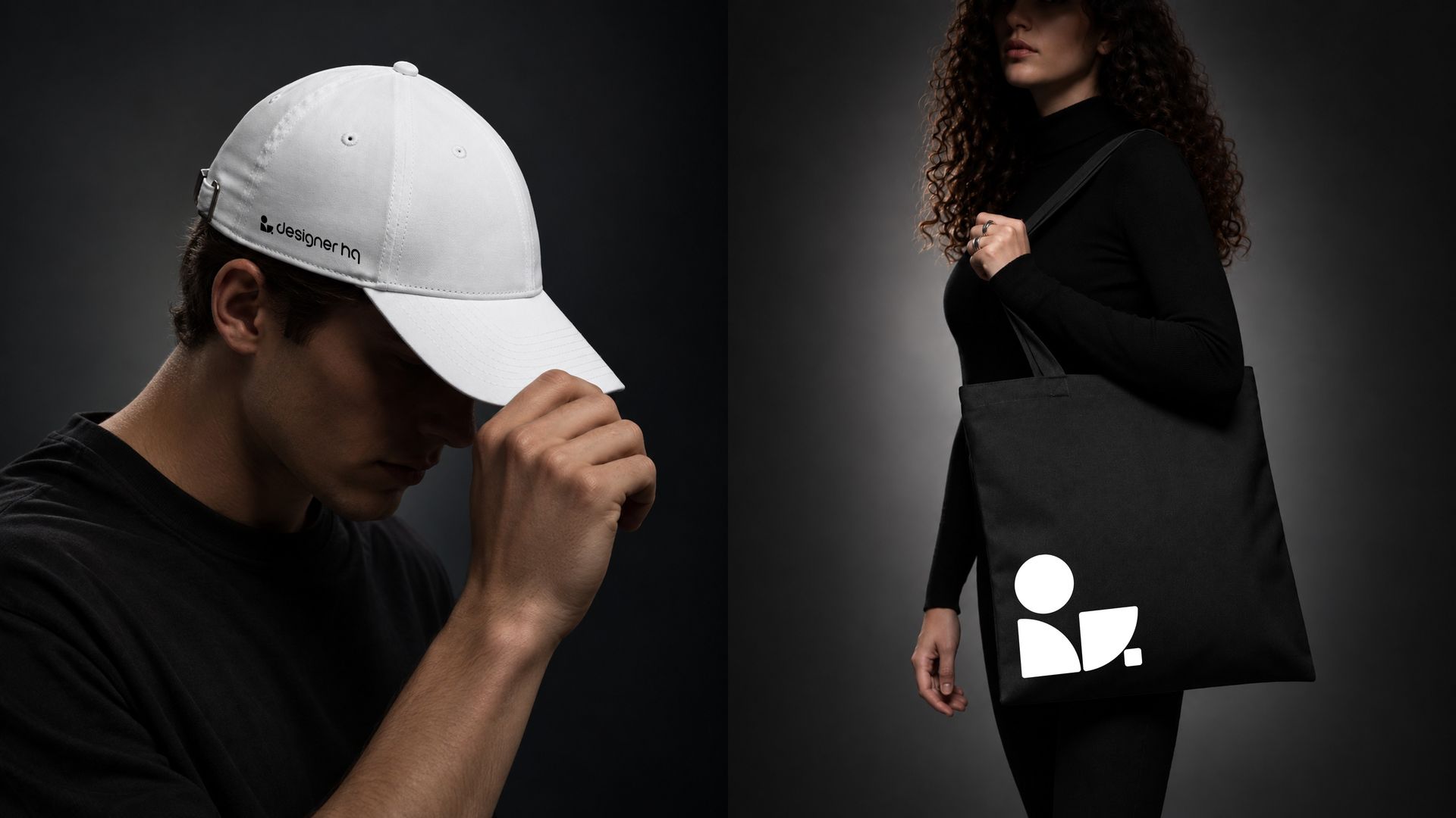
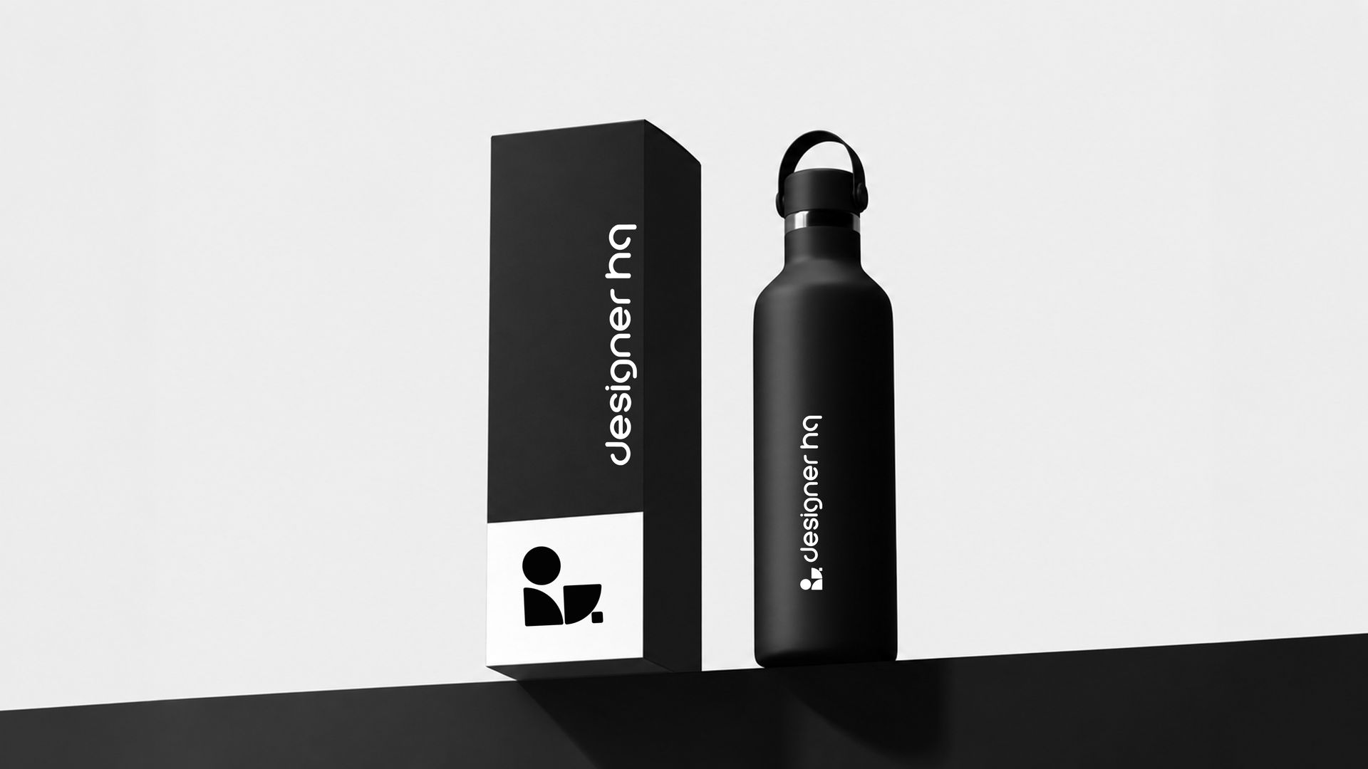
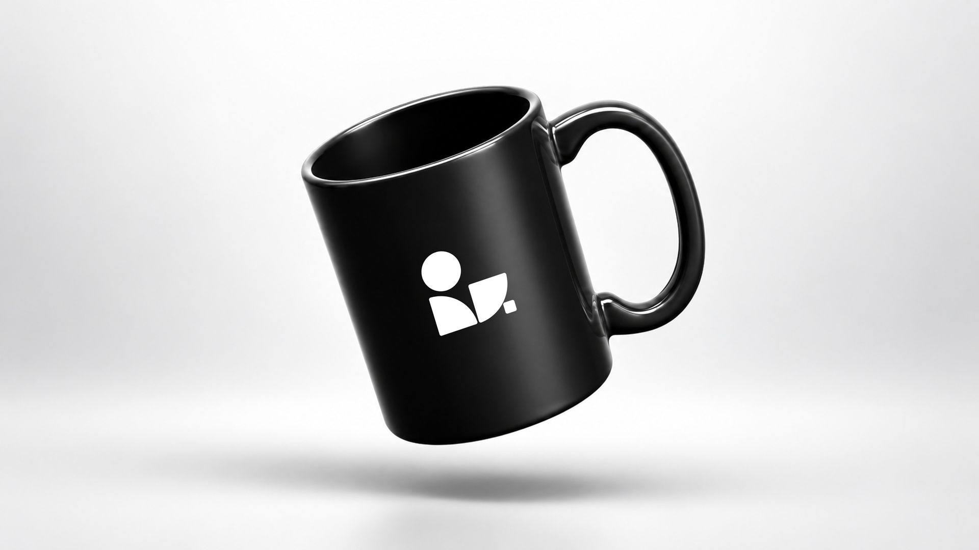
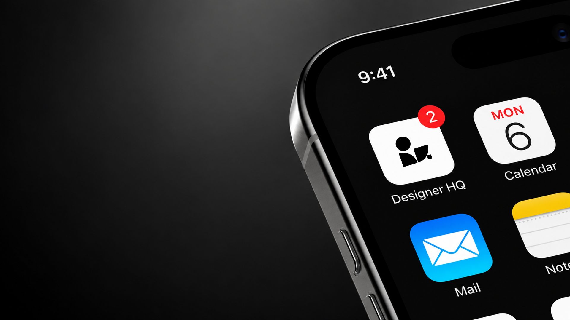
The identity extends across key brand touchpoints—from app icons and digital interfaces to merchandise, packaging and environmental applications. Each concept uses the same symbol, gradient, typography and visual system to create a consistent experience, whether Designer HQ appears on screen, in print or across physical brand applications.
THE OUTCOME
Designed by Mesh & Myth, a brand identity and creative studio based in Bengaluru (Bangalore), India, and led by Hemanth Kumar, Brand Designer, Founder & Creative Director, this self-initiated identity concept was created for Designer HQ, a creative workflow and brand-building platform by Nonstop Branding Limited. The concept brings together brand strategy, logo design, visual identity, typography, color and digital applications into one cohesive system—exploring how a modern SaaS and creative software brand can feel distinctive, human-centered, scalable and recognizable across every touchpoint.
Self-initiated concept shared with Designer HQ’s founder, who responded positively. Not adopted or final. All referenced names, logos and trademarks remain the property of their respective owners.